La Moitie Multi Commercial Space - Tradeshow Index Magazine

Tradeshow Index Magazine

Tradeshow Index Magazine featuring great design, architecture, fashion, graphics and innovation from across the globe.


La Moitie

The name of the project La Moitie originates from the French translation of half , and the design aptly reflects this by the balance that has been struck between opposing elements: square and circle, light and dark. Given the limited space, the team sought to establish both a connection and a division between the two separate retail areas through the application of two opposing colors. While the boundary between the pink and black spaces is clear yet also blurred at different perspectives. A spiral staircase, half pink and half black, is positioned in the center of the store and provides.

Continue reading
 

World's best designers, artists and architects.

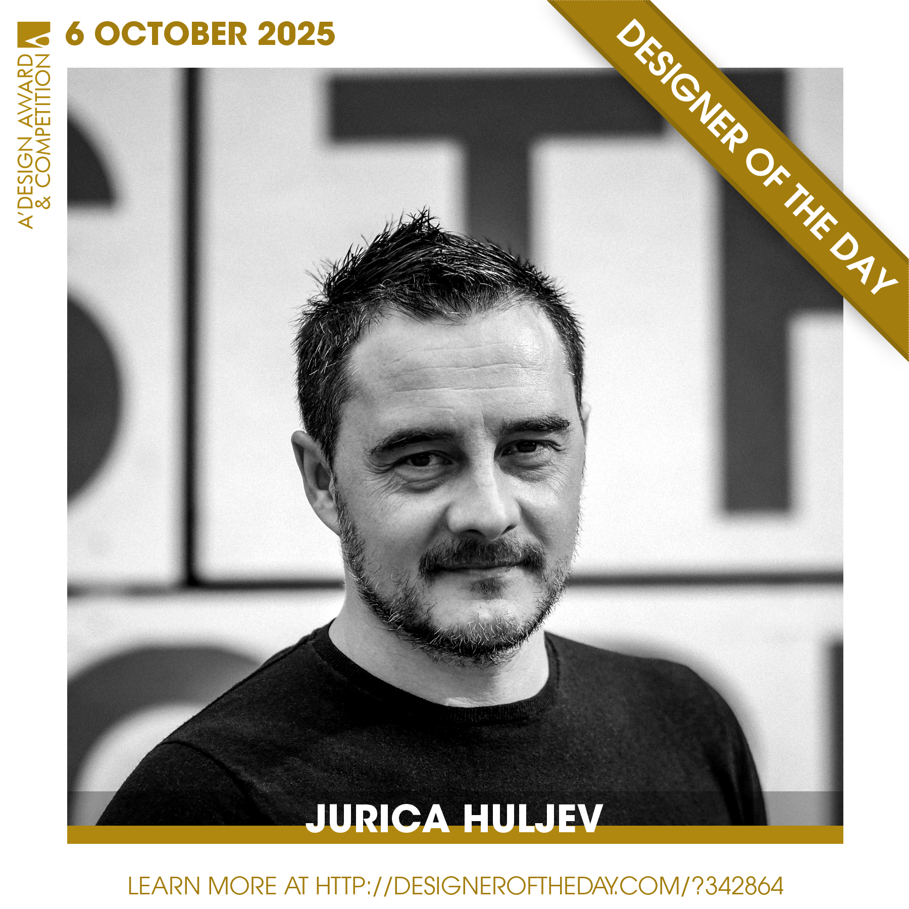
Good design deserves great recognition. Everyday, we are pleased to feature amazing designers who create original and innovative designs, amazing architecture, stylish fashion and creative graphics. Today, we are presenting you one of the World’s greatest designers. Checkout an award-winning design portfolio today and get your daily design inspiration.

Continue reading